023-68622637
Logo含义
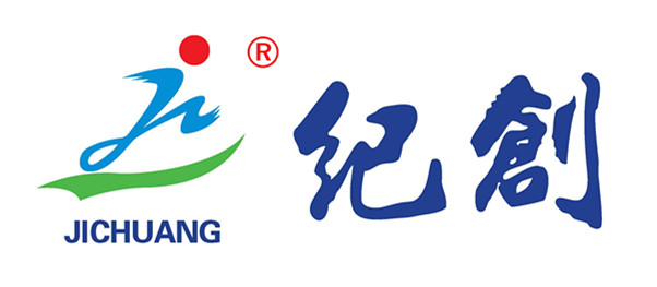
标识采取流线型设计风格为主,分三部分构成。
上部:“红色圆状图案”标识冉冉升起的太阳,寓意:旭日东升。
中部:“蓝色jc状图案”是根据汉语拼音纪创的第一个字母组合而成,寓意:世纪创新。
下部:“绿色线条状图案”象征勃勃生机的绿色大地,寓意:春意盎然。
整个画面代表纪创人犹如一个运动健儿,在勃勃生机的绿色大地上,迎着冉冉升起的朝阳,奔跑在人才服务的快车道上……
Our Logo is adopted with streamlined design style, composed of three parts. Upper: "Red circular pattern" identifies the rising sun, meaning: the rising sun. Central "Blue jc-like pattern" is based on the first letter of pinyin combination Ji-Chuang, meaning: Century innovation. The lower part "green line like pattern" symbolizes the vitality of the green earth, meaning: furious spring.
The whole picture represents a broker-founder is running in the fast lane of talent services like an athlete, in the vitality of the green earth, facing the rising sun...

